Pigment Prism
An event brand built to argue that AI
had to start proving itself.
Lead Designer
Creative Direction
Concept to execution
Virtual Conference
2025
By 2025 every enterprise software company was saying the same thing about agentic AI, and the audience had stopped listening.
Pigment's premise was sharper. Most AI deployments create the illusion of progress. Prism brought together the people who could show the difference.
It was also the first event brand built on Pigment's completed rebrand, and the brief was to stay close to it. Prism had to read unmistakably as a Pigment event.

My approach
The name already carried the idea, so the work was not finding a concept. It was building a visual language that would read as rigorous to an audience that had been marketed at for two years.
A prism takes undifferentiated white light and splits it into a visible spectrum. That is what the event did with AI: one broad claim, separated into outcomes you could point at.
So I built the concept into the mark itself. The identity performs the idea every time the logo appears, and no strapline has to explain it.
The concept
The system is built on fluted glass.
Light passing through it bends and separates, so a single shape behind it arrives in pieces and in colour.
The pattern is that effect held still.
The logo is the same effect applied to the wordmark, fractured and offset the way an object shifts when you look at it through glass.


The colours come from the language Pigment was already using for AI across its own marketing. Prism had to read as a Pigment event, and the palette is what makes that link immediate.

Visual Identity
The mark is broken on purpose. I fractured and offset the logo the way glass displaces what sits behind it, so the concept restates itself every time the brand appears.


The palette is built on pastel gradients. A literal rainbow would have read as consumer tech, so I went for the quality of light passing through glass: soft, continuous, physical.
Grain sits over the gradients so they read as material, and that texture is what keeps them from looking like a default digital effect.
The pastels were not only an event decision. Pigment was already moving that way across everything AI-related, so Prism extended a language the master brand was building.

The typography uses Pigment's existing brand typeface, DM Sans→, designed by Colophon Foundry for Google Fonts, to maintain consistency with the brand.


Application
Prism was digital only. One day of livestream, eight sessions, ten speakers, and the design system carried the whole production.
online conference & on demand hub
The platform branding and the on-demand hub, where all eight sessions sit together after the event. Session cards across keynote, fireside and panel formats, each holding between one and four speakers.
The sessions were pre-recorded in a studio, so the system ran from the set behind the speaker to the player around them.


Campaign
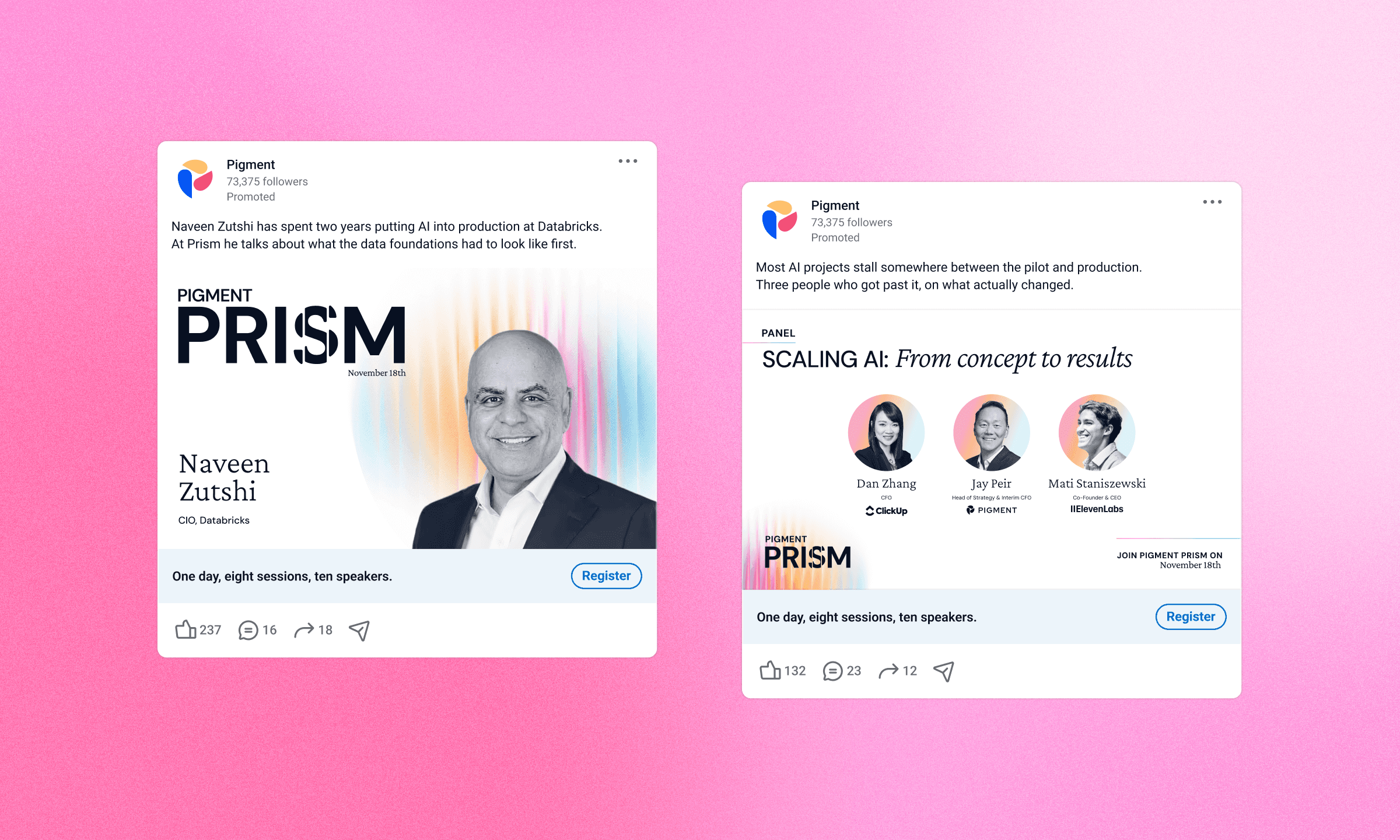
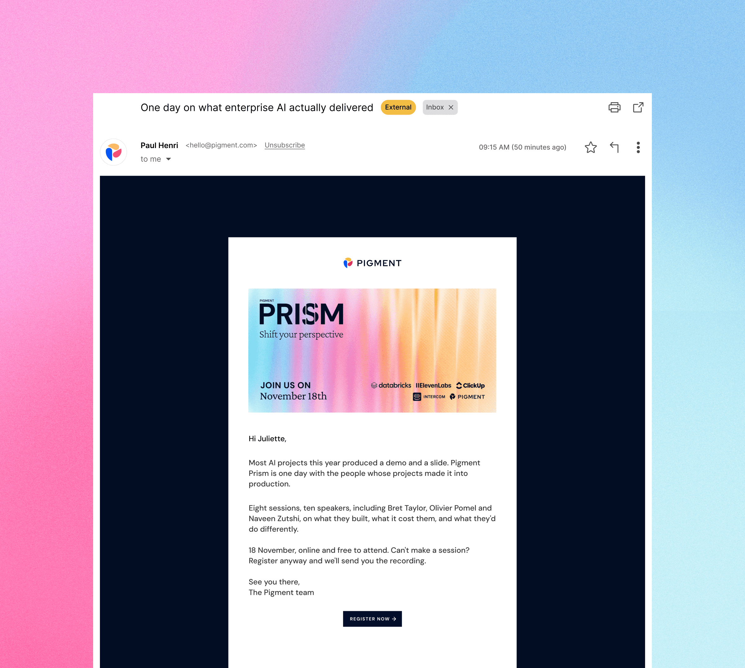
Paid LinkedIn in multiple formats, speaker cards carrying names and titles, and the email sequence that drove registration.
Speakers were confirmed over several weeks, so every asset had to come out of the same rules and drop in as the names landed.

Impact
$2.45M
new pipeline created
$20.8M
influenced pipeline
2,080
registrants
640
live attendees
123
on demand viewers

Who spoke
Sierra
Datadog
ElevenLabs
Databricks
Intercom
ClickUp
Glean
Next project
SWTCH


