SWTCH
by Pigment
An event brand built to run across two formats, four cities and two languages.
Lead Designer
Creative Direction
Concept to execution
SWTCH Online + SWTCH Live
2024

My approach
Two formats with different requirements: a three-day online conference, and a year of smaller in-person events. The brand had to work as a set of rules, so new assets could be built as the programme grew.
So I started with a workshop, to get six stakeholders to agree on what SWTCH should feel like by putting them inside the experience before it existed. I built an image bank in FigJam and asked one question: if SWTCH were a texture, a city, an animal, what would it be? Then: you're walking into the venue. What do you see, hear and smell?
The theme was convergence. Because the personality was agreed before I designed anything, I presented one concept. It was approved without a second round.
The concept


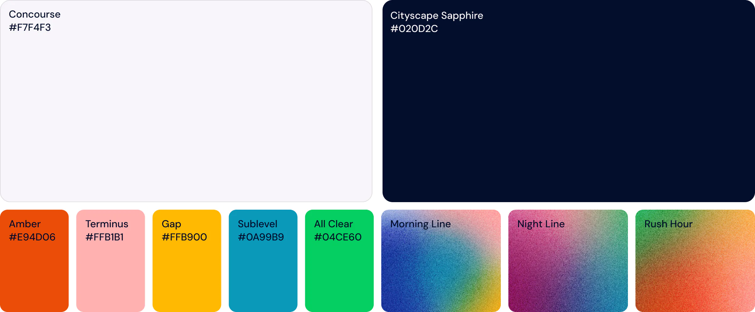
The palette is built on two base colours: Cityscape Sapphire for brand-facing moments, Concourse for functional ones.
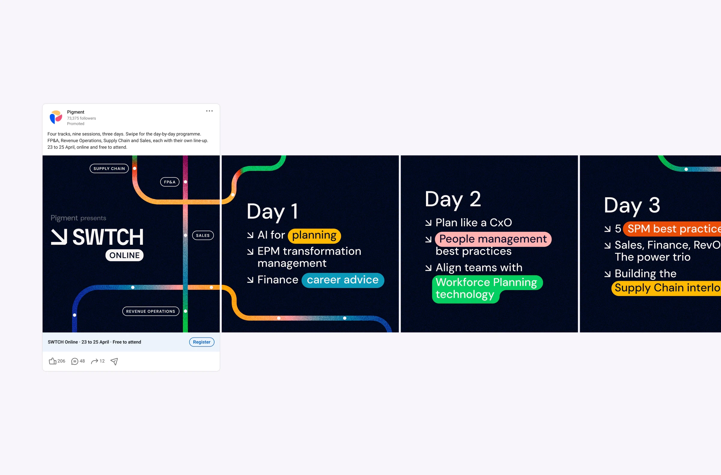
The accents work two ways. They run through the lines as a gradient, and they sit individually on session cards, one colour per track, so the audience can tell at a glance which part of the programme they're looking at.
They run saturated on purpose, to hold at small sizes, survive print shift, and not overwhelm a venue wall.
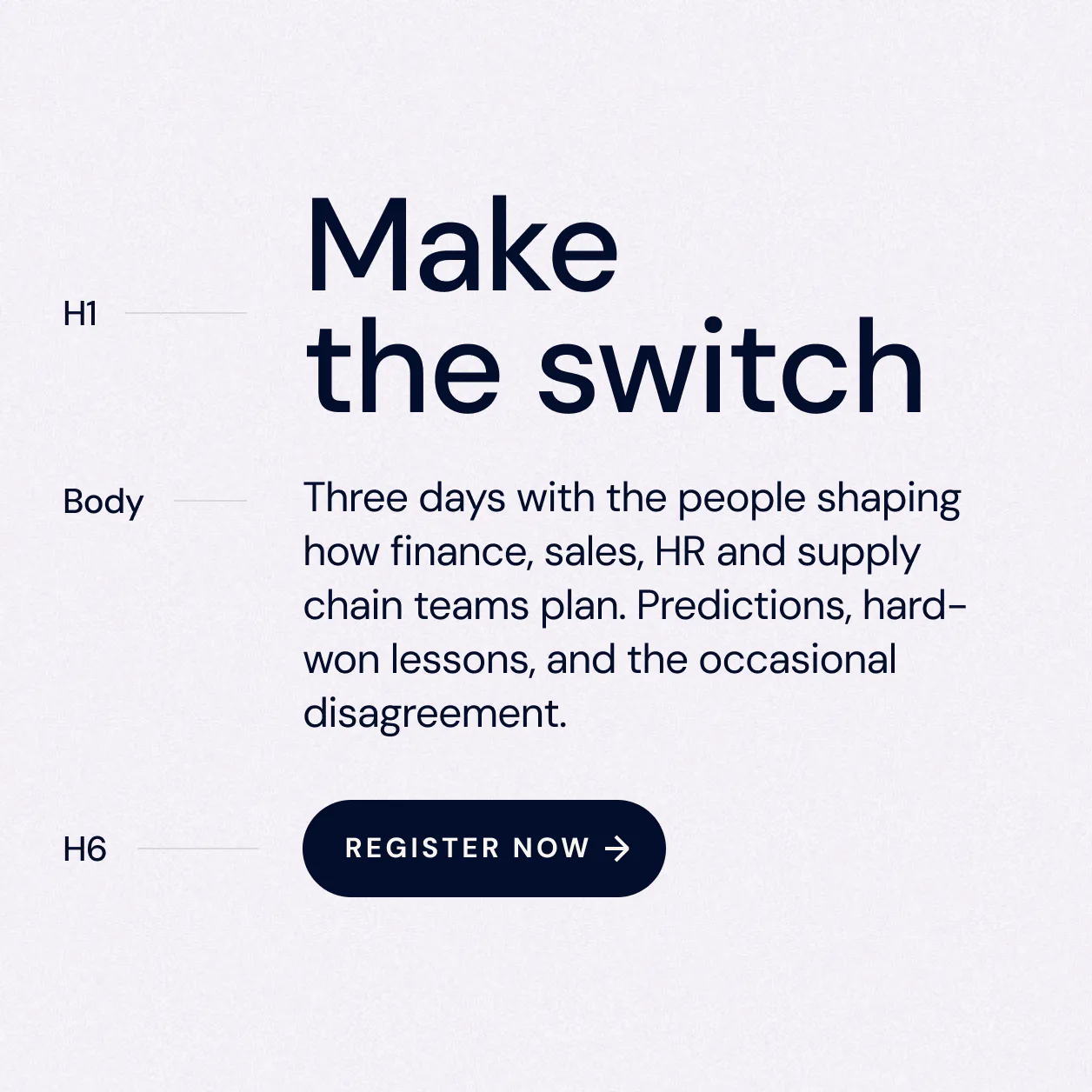
The typeface is DM Sans, carried over from the rebrand underway at the time. Keeping it was a stakeholder requirement and the right call. SWTCH needed to read as independent, but not as a different company.
It was also operational. As a Google font it was already in the Workspace tools Pigment ran on, so sales decks could use the real typeface with no licence and no install.


The transit map is a system of lines that shift through the full palette, with stations marking points along them.
Most images of convergence lose the individual parts. Rivers merge, roads join. A transit map is the only system where separate routes stay distinct while still sharing stations, which is exactly the relationship between the four tracks.
The lines generate the layouts. One can run the width of a banner, frame a speaker card, or wrap a venue wall, and a station marks where the logo or the message sits.

Digital
I designed the full UI system for the registration and post-event recap pages, built for implementation in Webflow rather than handed over as flat comps.
The system also extended to Goldcast, the streaming platform the sessions ran on.

Campaign
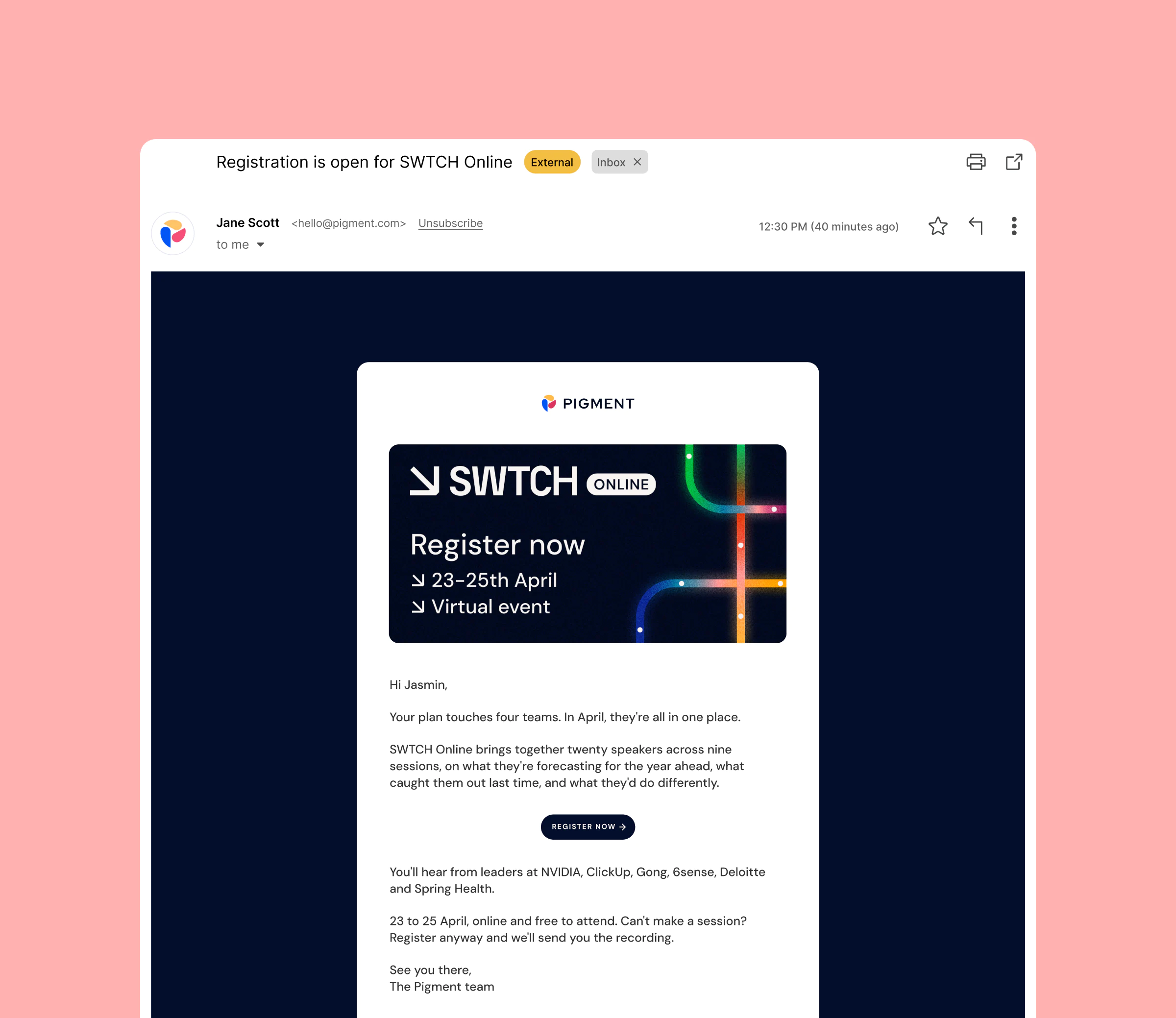
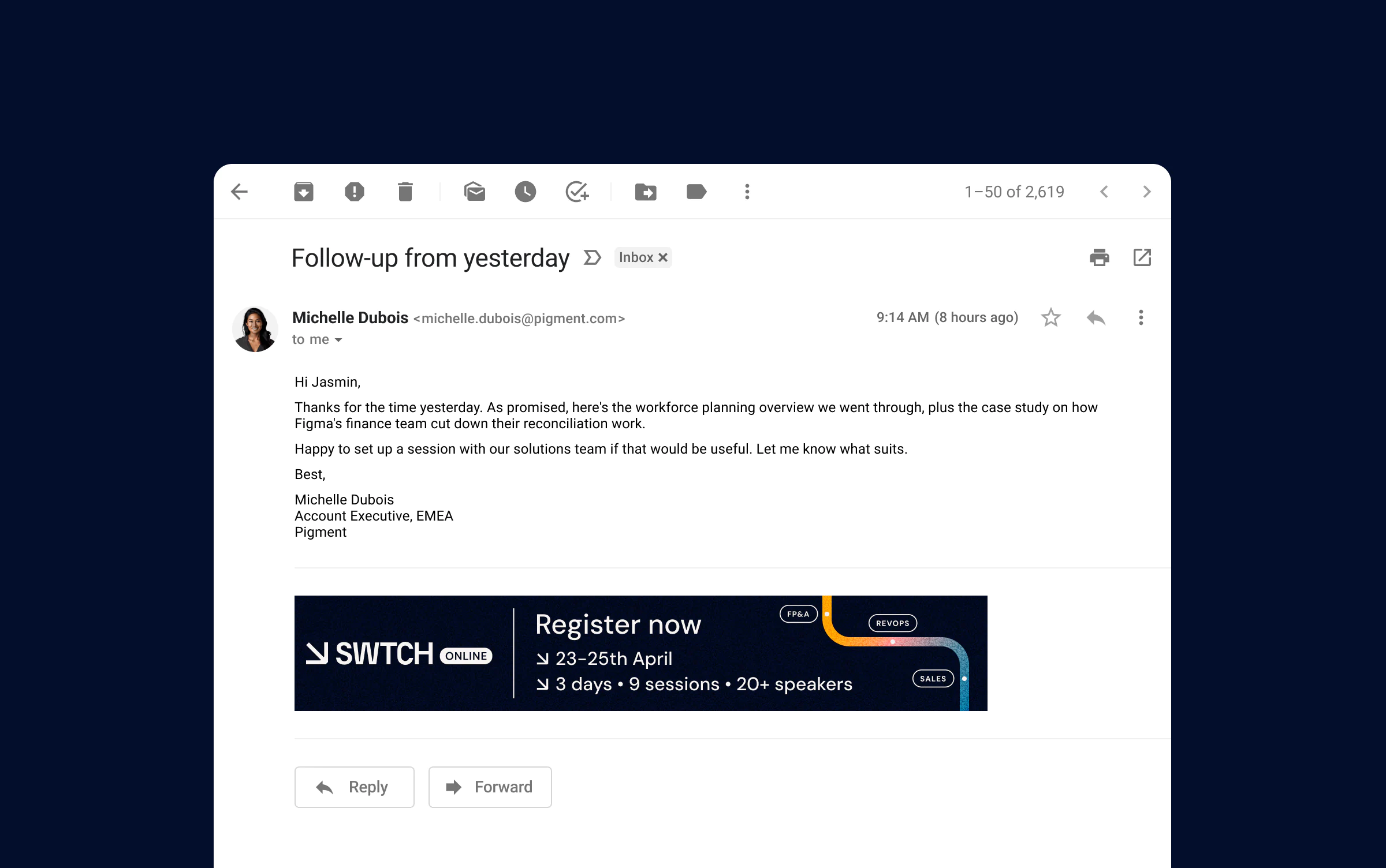
Paid LinkedIn in static and carousel, email, session promos carrying speakers and time slots, and social for company channels. Dozens of assets, all generated from the same rules rather than designed one at a time.
The set also included employee advocacy assets and personal profile banners, so Pigment staff could post about the event on their own channels.

Print & environment
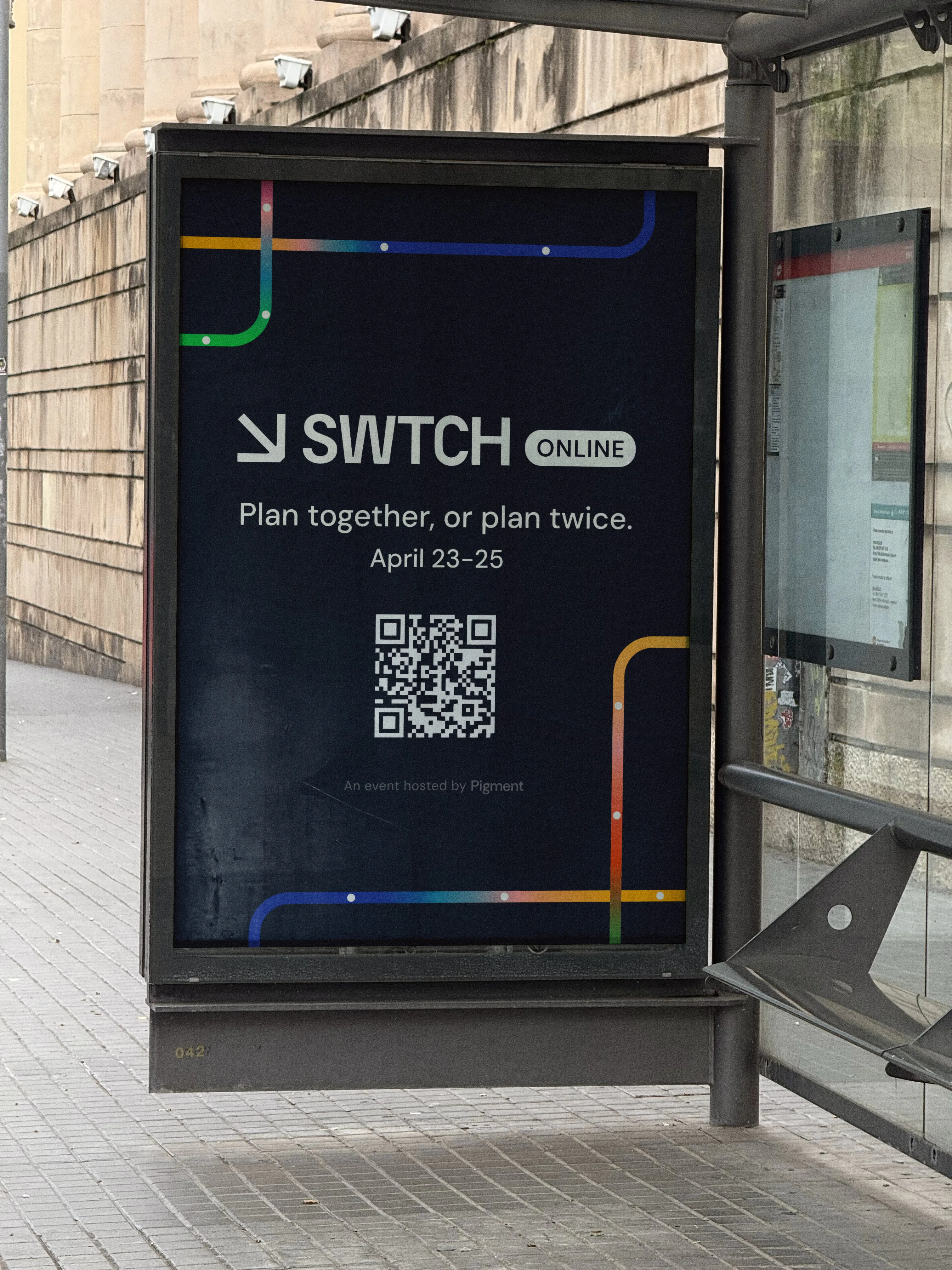
The in-person events are where the system met physical production. Screen colours shift on paper, and a line that works in a banner ad has to hold at the scale of a room.
The same rules had to produce all of it.


Results
$2.2M
new pipeline created
$11.5M
existing pipeline engaged
2,002
registrants
726
live attendees
9
sessions
Audience by region
62%
North America
35%
EMEA
3%
Other
3
in person events
& 106 attendees
Who spoke
NVIDIA
ClickUp
6sense
Deloitte
Spring Health
Gong
Who attended
Disney
Dow Jones
Unilever
Grammarly
Visa
Square
Datadog
ServiceNow
Wavestone
VMware
Bouygues Immobilier
the year after
The identity carried the in-person series through the following fiscal year, including London.
Most conference identities only need to hold for the length of the event. This one kept going for twelve months after it, through the in-person series, including London.
The workshop is still referred to at Pigment years later.